


Wind and Fire by Cheryl Landmark
Published May 1st 2010 by Asylett PressPaperback, 232 pages
Isbn: 1934337706
Isbn: 1934337706
Source: I received a copy of Wind and Fire in exchange for an honest review, courtesy of Cheryl Landmark. This has in no way influenced or affected my review and opinion of the book.
You can also get it on Bookdepository for $13.62

"Zardonne, Master of the Dark Rift, has ripped a hole in the fabric of Tellaron and invaded with an army of hideous demons. Oblivious to the dangers and evil brewing beyond the borders of the quiet Ardis Valley where she lives, nineteen year old Tenya toils through a life of dreary loneliness and drudgery plagued by strange, disturbing visions, yearning desperately for the beautiful mother she had not seen since she was three.
Her life is abruptly turned upside down when she is abducted in the middle of the night and sent on a perilous journey that will test her courage and the fledgling powers buried deep within her. For not only does she discover that her missing mother, Elea, is a powerful sorceress able to control the forces of the wind, Tenya also learns that she herself possesses a singing power that manifests itself as white fire throughout her body. Can she find her mother, and the strength to use her own powers, in time to save Tellaron from the evil Demon Master? Her world depends upon it."

6/10

This was an epic tale of a young girl learning that she is not so normal after all and that everything is not what it seems. She steps into a magical world that was put together very well by Cheryl Landmark. The story was action packed and it flowed nicely.
If you like fantasy, action, heroines and villains then chances are you will like this!
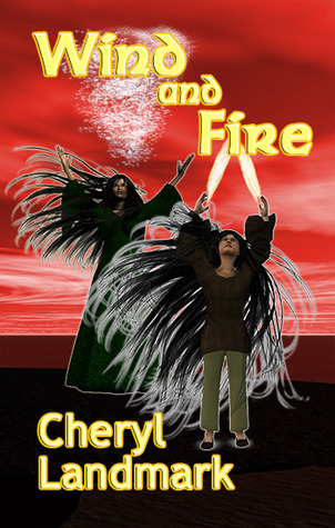
This was one of those novels that you shouldn't judge by its cover. It was a great début novel and I look forward to seeing what Cheryl Landmark will do next!
Mild Spoilers:
I don't have many complaints, except that I felt that Tenya came into her powers a bit too fast and that her mother speaking to her and helping her through tough situations was just too convenient.

http://www3.sympatico.ca/cheryl.landmark/

"Tenya tingled all over and, still with that same strange sense
of detachment, she saw a soft white light suddenly outline Sindril,
the murbeest, and herself. A rush of adrenaline–and something
else she could not define–pervaded her body."
of detachment, she saw a soft white light suddenly outline Sindril,
the murbeest, and herself. A rush of adrenaline–and something
else she could not define–pervaded her body."


9 comments:
Hmm, I have to admit I'd have a lot of trouble not judging this book by its cover.
I appreciate feedback from readers, but I'm curious as to what they think is wrong with the cover.
Cheryl Landmark
Author of "Wind and Fire"
Thank you very much, Lu, for your honest review of my book. I appreciate all the support you've given me in promoting my writing.
Cheryl Landmark
Author of "Wind and Fire"
Great review. Sounds like a interesting book. And I agree don't judge a book by its cover. ;)
Its only a pleasure Cheryl!
I think the thing with the cover is that we all like to see "pretty" or "interesting" things. Although your cover is fitted to the story I think a more "appealing to the eye" cover would draw more attention.
I myself have read a book just because of the cover I must admit.
My problem with the cover is not that it isn't pretty or interesting, but rather that the quality of the image is very poor. Unless you can get a fantasy art cover that can compete alongside the many other fantasy novels around these days, I think it would be be better to go with something simple or abstract that catches the eye.
Thanks, everyone, for the feedback on the cover. Being a newbie in the publishing world, I thought the cover was quite dramatic and eye-catching when my publisher first showed it to me. Now, when I see all the other "pretty" covers out there, I can see where mine could probably be improved. Another lesson learned about what readers want from authors. :)
Hmm, it is eye-catching, but not in a good way.
In my opinion, you should always go for quality, even if that means you're forced to do something very simple. For example, I think a plain black cover that just had the title and your name in silver or white letters in a stylish font could look very good, and the colour contrast would be striking.
You could also add a small picture or silhouette, like the cover for Jonathan Strange and Mr Norrell: http://www.goodreads.com/book/show/76852.Jonathan_Strange_Mr_Norrell
I appreciate your suggestions, violininavoid. It's definitely something I'll keep in mind for my future books.
Post a Comment